Thursday, February 24, 2011

Book Cover HELP

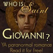
Hello and good day to you! So here is Ashley Stewart's (the artist I'm collaborating with for WHO IS SAINT GIOVANNI?) sketch of the cover for my novel. We've gone through several drafts, and this is what we've settled on for the moment.

Are you confused? Do you not know what this "Who Is Saint Giovanni?" thing is all about? Never fear, by clicking THIS link, all your confusion will disappear. :-) <yeah, I'm corny, but then...you already knew that lol>

She's awesome, right?? She's going to be painting it, of course, and we might be adding some photoshop special effects, so this is a rough draft of the cover, really. But I need your help, friends!

Now look at where I had planned to have the text added:


Imagine it in color. If you're a little curious about the big round thing behind his head, it's a halo, which I think will become more clear once it's in color.

My question to you:
Does this draw you in? Do you have any suggestions? Honestly, you won't be hurting my feelings or Ashley's by stating what you think could be improved.

Here is another cover idea:

How does this compare to the one above? I WOULD LOVE and be IMMENSELY appreciative of ALL suggestions. Thanks guys. You know I love you :-)

Comments (37)

Loading... Logging you in...
  • Logged in as
My vote is on the first one! I really like it!
2 replies · active 735 weeks ago
Thanks Keary! I really like it also. There is something really compelling about his eyes, and the mystery surrounding why the girl is falling off the edge.
i like the second one better. there's something you want to find out in the second one.
I actually like the second one better. But if you like the first one then you should do that one! :)
1 reply · active 735 weeks ago
Hi Julia, I think the problem is that I don't know what I want. The possibilities are ENDLESS, and that makes it tough. Thanks for your vote though. :-)
Gorgeous! What a talented friend you have. I like both of them, though the first one grabs my attention more.
1 reply · active 735 weeks ago
Thanks Shallee! If I saw both covers on a bookshelf somewhere, I think I'd be drawn to the first one also. Do you think the text is a distraction? Thanks for stopping by!

:-)
I love both of them. In the first one, his face really is just amazing, but I get kind of sad that it's covered up. I like the general hotness of the guy in the second one, also. It seems to have an overall more balanced look to it with the text.
1 reply · active 735 weeks ago
Thanks Jessi. You've got me thinking about that text! What if the text circled the the outside rim of the Halo?
Kudos to the artist. I like the one with the title over his face but wonder if shielding him more would put more mystery into it. Or more of a profile of him in a cloak or something. Do the arrows for the "I's" fit in with the story?
These are really incredible. Your friend is talented. I like them both (I like the guy better in the first), but I like the second one just a teensy bit more. I think I like seeing the female character more closely.
1 reply · active less than 1 minute ago
KAT: noted!! :-) Thanks
The first one looks like he’s all inside her head. Rather like fantasy/ghostly person looking over her, or something she's made up. The second I agree with the poster who said the words don’t look right over his face. The third (and my favourite) reminds me of a cover for a YA novel. But wow, the artist is amazing!

Anyway, crusader dropping in and saying hi.
1 reply · active 735 weeks ago
Thanks for this! It really helps!!
WOW! Your comments are great.

I always thought that the text covering his eyes added to the mystery. But maybe I'm crazy and that was just me and my mom who thought that way LOL. Ashley sketched up a version where there was room for the text to be next to his face. I also have a vision of title circling the outside of the halo, but I don't know how that would work out.

This is definitely hard!! :-) Yes, and you're all 100% right. Ashley is great!! :-)

I also have a vision of the girl falling backward, that way you can see her face more clearly. Well, you guys really inspired that idea by reading your comments. Hmmmmmmmmmm.......

LISA: The arrows can fit into the theme, but are you trying to hint that you hate the font? lol I'm trying to decide how I feel about it. I played around with some other fonts last night, but my mom thinks they are too delicate and pretty. And, I always listen to my mother haha...nah, just joking.

What if the guy's head was smaller (Ashley had it this way at 1 point) and the girl and the scene were larger on the page? And then....if the text was work in some other way.

This is a challenge. One I welcome, and your help makes it less taxing. Thanks everyone!

I'm open for any other ideas on top of what I've already mentioned.
Wow, those are quite the sketches! Hats off to the artist!

I like the first one better because it seems to have more action and makes me want to know who both of the characters are, and what the girl is running from or towards.

However, I kind of wish the font wasn't so large over his face! Was that done on purpose to add more mystery, or could that be changed?

Just my thoughts!

Erin @ Quitting My Day Job
1 reply · active 735 weeks ago
hehe Yes, it was on purpose. I thought it added to the mystery. I am SO glad you guys are stepping forth with your ideas.

Thanks Erin.
No I love the font, it just makes me wonder is the design of the " I " is a clue to the story. The arrows make me wonder if its some type of coded message thingy. I like the title over his face except for his eyes showing through.
I meant I like his eyes showing throuhg. Adds to the mystery.
These are too cool! I think an awesome gradient of some sort (like the second one, but even more color) would look awesome with the first picture. Although, I do love the detail of the girl's face in the second cover. The first one does have me more interested in the book. :D These are amazing!
It's a tough choice because these are both amazing, but as a reader, I think I'd be more likely to pick up the first cover. I feel like it might tell more about the story. And I want to know why she's jumping off the bridge!!!
I like the first cover more but I would like it better if the face of the guy can be completely seen.
I loved both of them, I didn't like the font covering his face. It doesn't make the cover looks good, in my opinion. The second cover, looks like a cover of a YA novel.
Definitely the first one! In all honesty, I would probably skip checking out the book if it had the second cover. It doesn't draw me in at all. Hope that helps!
Hi fellow crusader. I love both pieces of artwork - they're fabulous! My preference would be for the first one, but I'm not sure about having the writing over the face. Having said that, I'm not sure where it would fit without making it too small. The author name plays in with the artwork nicely, while the title seems to fight with it somehow.

Nonetheless, I think it's great. I wish you luck with it.
Your artist is fantastic!

The stylized font and his face compete too strongly with one another for my taste. If his face was dimmed in Photoshop, then it might work better. The way it is now, I'm more interested in the art than the text so I want to brush the text away. I like where your name is though. :) This one feels ethereal in nature, its foreboding as well. Why is she runnig? Who's the guy? etc.

I like the balance of the second one better. I like seeing both their faces, the boy looks casually cool (and hot!) and I get a sense of a relationship, him watching her or something. However, it feels more like a romance cover.
1 reply · active less than 1 minute ago
What a great way of summing it up. I can just imagine you trying to brush the text away, Kari. :-) Thanks for your thoughts on the matter!
The first one is interesting, but not sure about covering his face with the text. She also looks like she's taking a flying leap into the water. I like the second one the best. Is he leaning on something? There looks like a split. It's kind of confusing. I must say I like the button you created as far as a cover the best. I think it's very mysterious.
Hi! I just had to stop by and add my thoughts. I'm an artist as well as a writer, and I LOVE the faces on both designs; I agree that it IS a shame to cover his face up with the words on the first one, although his eyes are the most arresting and those DO show up. The design on the first seems the strongest to me composition-wise, but the foreshadowing/perspective on the girl figure is not quite right. (left thigh too short, right arm looks shorter than the left one)

On the second one, the background is a little cluttery. The movement in the girl's hair is wonderful. At first I thought she was wearing overalls and that her book was part of the overalls, the way it's lined up. Having color might clear this up, however. I think the font is really cool, with the arrows, although the placement is a bit of a problem. Does that help? You did a great job on your video, by the way--cool special effects! I've made a couple in Flash, but I didn't have all those nifty effects. ;o) I'd be glad to discuss more with you if you write to artzicarol [at] gmail [dot] com!
New follower. : )
l like the first one but l think it's really hard to find a place to put the text. I like the second one the most, amazing drawings. I love the mystery of the guy in the second picture, goes so well with the titles and draws me in!
I like them both, probably the first one better. Agree that the text could be moved...perhaps to the lower left corner? What a talented artist!
AWESOME COMMENTS EVERYONE!!

Thank you!!!
I don't like how the text is in front of the face in the sky. I'm rather old school about how covers are designed (my favorite cover artist is Michael Whelan) and he often said that he extended many of his covers upward to make room for the title. I almost would box this cover in and then have just a plain background above the cover where you could house the title.
I really like the second mock cover the best. It draws me in. Beautiful work.
I like the first one. Not so sure about full color though. I really like the pencil sketch. Maybe just two or three colors.
Rane's big bro's avatar

Rane's big bro · 735 weeks ago

Im not too keen on the writing over his face, and think the idea of the words arched around the halo would be cool if it were the top of the hallow. You would have to bring his face down though so that the text wouldn't be pushed to the top margin of the cover

You could have a dual cover release and use both images.

Post a new comment

Comments by